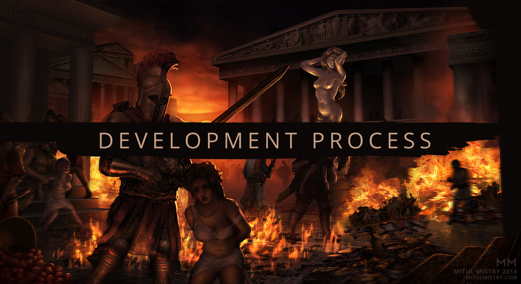
Illustration Process – Pillage
Reading Time: 3 minutes
Context
Before working on a painting, I like thinking about the context of what it is I’m actually trying to explore and communicate. Yes, I want to create a nice looking image, but if that’s my only goal, it limits the painting’s potential.
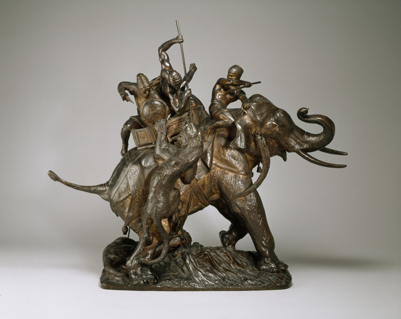
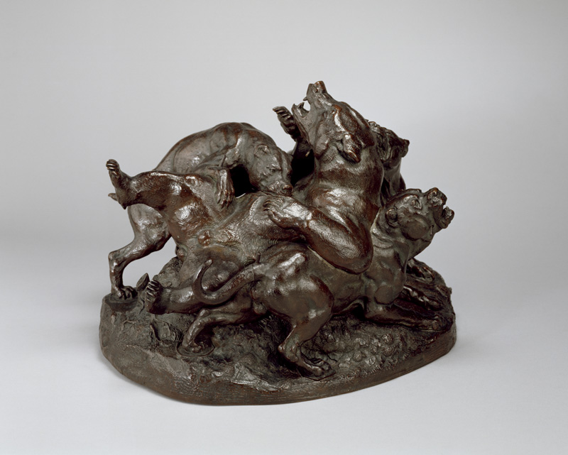
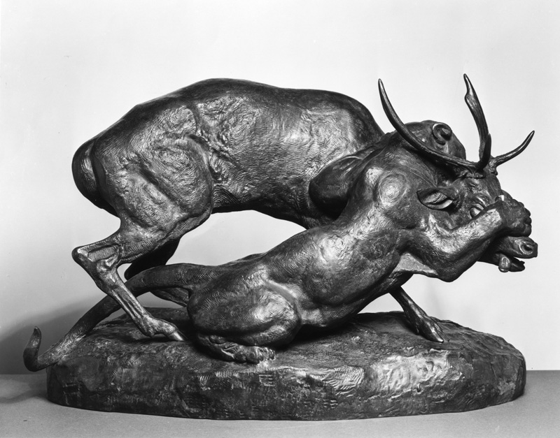
For a short art history lesson, it’s worth taking a look at the work of French sculptor Antoine Barye (Click the image or use the arrows).
As apparent, his subject matter was mostly animals in varying acts of violence. Today, it might seem to us like a bunch of badass macho sculptures, and we might appreciate Barye’s work the same way we appreciate a Frazetta painting. And to a degree, this is valid. But if you actually examine the context of his work, you’d discover that Barye grew up during the Napoleonic Wars, a series of conflicts that had an unprecedented scale of violence for its time. If you had grown up in this period, it would’ve been like growing up during a World War. So yes, it’s sculpture about animals, but it’s also reflection of the spirit of the time.
With my own work, I’ve always been interested in the idea that western architecture is meant to symbolize order and harmony – and yet the ancient Greeks, who originated those architectural styles, were a militant, violent culture as well. Beyond that, I think of the burning of the Library of Alexandria, and the Bonfire of the Vanities; all represent a contrast between order and chaos, and that’s something worth exploring in a modern, 21st century context.
You can be forgiven if you think all of this sounds pretentious, but when you’re thinking about these sorts of things, it can really help elevate your work. Fantasy knights with cool armor can only be drawn so many times, and there’s always somebody else who can draw them better than you. You have to find ways to make your work unique and relevant.
Thumbnails
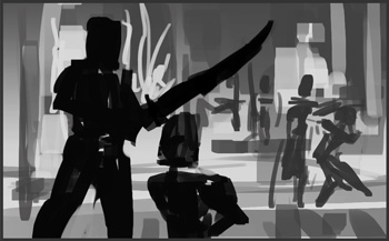
With my initial thumbnail, my goal is to capture the essence of the idea. My first thumbnails are usually pretty crude and simple, but that helps me figure out the most important elements that I want to communicate.
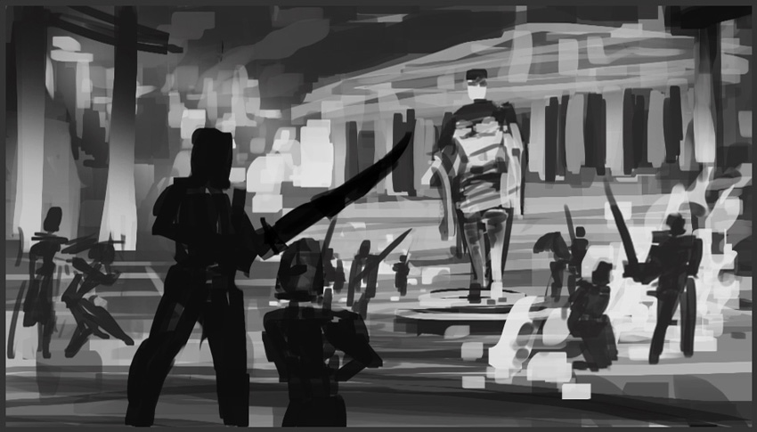
I then expand the thumbnail into a larger composition. I’ve been continually developing my thumbnailing process; in the future, I want to be even clearer and more graphic with my thumbnails. I watched Eytan Zana’s Gumroad tutorial on graphic compositions and that’s something I want to integrate more into my process.
Rough Sketch
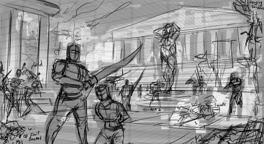
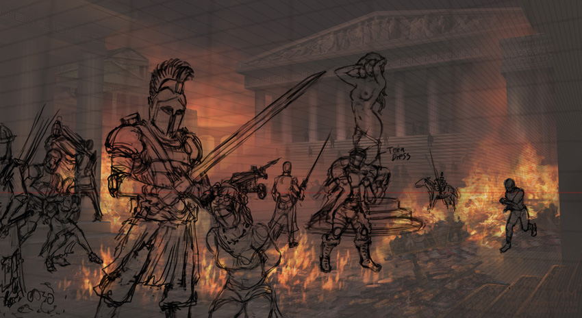
Once I had an overall vision for the painting, I drew a rough sketch over it to get a better idea of the placement of the elements and gestures of the characters. Establishing a perspective grid at this point helps to make sure any future drawing conforms at least roughly to a realistic representation of space. It doesn’t have to be perfect since this isn’t scientific illustration – it just needs to be believable.
Block-in
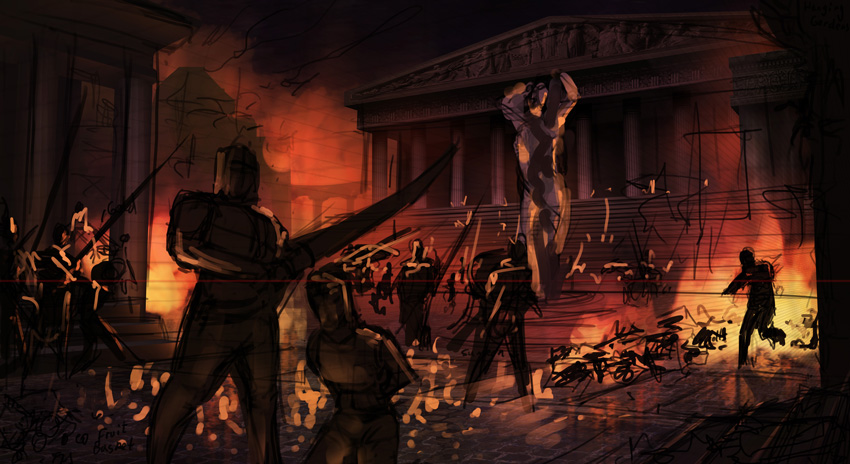
At this point, I block in color and value. This is what I use to build the rest of the painting on top of. Essentially it’s a color comp in the painting itself.
Character sketches
Refining the drawings of the characters was important at this point since they’re such a central focus of the composition. I could have done this earlier, but I just wanted to get a better idea of how the environment and value structure would develop (since I didn’t do a color comp for this).
Finalization
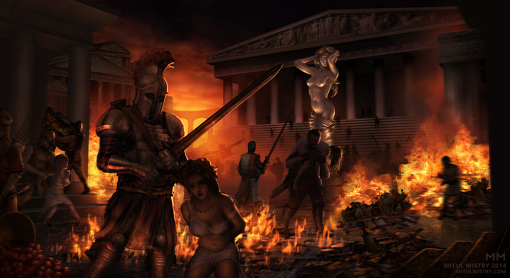
After that, it’s just a matter of detailing and continual refinement – a time consuming process, but most of the actual work of composing the image was done prior to this stage. It’s mostly painted, with a few photographic elements thrown in to speed up the process. It’s challenging to keep in mind all of the theory discussed prior while noodling away painting armor rivets, but it’s a process I’m continually evolving.
Check it out on Deviantart.

Leave a comment